Keyboard accessibility for in-app widgets
Choose modal or non-modal behavior for an in-app widget, then test keyboard access, focus, Escape and the return to the original task.
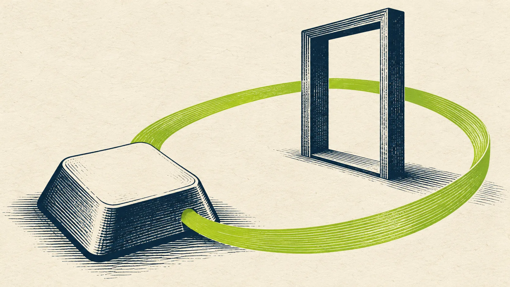
A changelog widget can open perfectly with a mouse and still interrupt someone who uses a keyboard. The panel appears, but Tab keeps moving through the page behind it. Closing the panel sends the person back to the beginning of the application. The update was readable; returning to work was the difficult part.
For a product or engineering team, the useful question is concrete: can a person open an update, follow its content and resume the task they paused? This article works through a hypothetical invoice screen to help you choose and test that interaction. It is not an accessibility audit of Sinalio or any other vendor.
Follow one interruption from beginning to end
Imagine an accounts manager preparing an invoice. Beside the navigation is a What's new button. An update explains a new export option. The manager wants to read it and return to the invoice without losing entered information.
In the first version, the launcher is a clickable icon with no keyboard interaction. A developer fixes that, but opening the panel still leaves focus on the launcher. Tab then reaches a customer selector hidden behind the overlay. Escape does nothing. Eventually the manager finds the close icon, activates it and has to rediscover their place.
These are different defects along one journey. Replacing the launcher alone cannot fix the rest. Use a real button for the opening action, with an understandable name such as What's new. The button pattern expects activation with Enter and Space. If the destination is simply another page, an ordinary link is the appropriate starting point. [1]
Our earlier article on adding a changelog starts with that simpler page-and-link option. The following decisions become relevant when an overlay genuinely helps people remain in their current workflow. [2]
Choose whether the invoice stays available
A modal temporarily makes the underlying application unavailable. For this example, the manager finishes reading or closes the update before interacting with the invoice again. A non-modal panel lets the manager keep using the invoice while the update is open. A panel drawn on the right side of a screen could implement either behavior; its position does not decide the interaction.
Choose a modal when the short interruption is deliberate and the rest of the screen should wait. Choose a non-modal panel when someone benefits from comparing the update with controls in the application. The second option needs enough space and a sensible reading order. A cramped panel that covers the invoice while allowing focus behind it gives the manager the costs of both approaches.
For a modal, the WAI ARIA pattern moves focus inside, keeps Tab and Shift+Tab within the dialog, provides Escape to close and normally restores focus to the opener. Give the dialog an accessible name tied to its visible heading. Mark it modal only when the underlying interface really is unavailable. [3]
A straightforward non-modal alternative is a disclosure: the button reveals content in the page, and its expanded state tracks whether that content is visible. In our invoice example, place the revealed content immediately after the button in the document order. Focus can stay on the button, with the next Tab reaching the panel's first control. This is a disclosure design, not a universal prescription for every non-modal dialog. [4]
Make the improved journey explicit
For the modal version of our example, the opening action brings focus to the update heading. The heading must accept programmatic focus, for example with tabindex="-1", without becoming an extra Tab stop. This update contains several paragraphs before its links. The manager reads the explanation, tabs to the export documentation and then to a visible Close button. Closing returns focus to What's new. The invoice values are still present. This is a proposed acceptance scenario, not a measured result.
The native HTML dialog element is a useful implementation starting point: showModal opens a modal dialog, while show opens a non-modal one. The modal has built-in Escape behavior by default; a non-modal dialog does not get that same default. Both still need a clearly available closing mechanism and deliberate initial focus. [5]
There is an important embedding boundary. MDN notes that a modal dialog inside an iframe makes its own document inert, not the surrounding document. A team embedding a widget in an iframe must therefore test the whole host page rather than assuming that a dialog inside the frame blocks every invoice control outside it. [6]
For our disclosure version, the manager expands What's new, reads the update and can tab onward into the invoice while the panel stays open. There is no cyclic modal focus boundary. If you add an internal Close button, closing from there should put focus somewhere sensible, such as the still-visible launcher. Do not leave focus inside content that has just disappeared. This preserves the logical sequence required by Focus Order. [7]
Test what happens around the panel
Keyboard operation covers the complete task, including opening links and operating controls within the update. A working launcher is insufficient if the feedback form inside the same widget requires a pointer to submit. WCAG's Keyboard criterion concerns equivalent functionality through a keyboard interface, subject to its stated exception. [8]
A visible focus indicator tells the manager which control will respond next. Keep it distinguishable on the launcher, panel controls and host application. A screenshot of the open panel cannot establish this: move through it with the keyboard and watch each stop. [9]
Also inspect the host page with the non-modal panel open. A fixed panel or sticky footer must not entirely hide the currently focused component under the Focus Not Obscured minimum criterion. Try a narrow viewport and zoom because the overlap may only appear when the layout changes. For user-opened content, the criterion also permits a way to reveal the focused component without advancing keyboard focus. [10]
Keeping focus inside an intentional modal is compatible with keyboard access when a keyboard route out exists. A component that cannot be left with the keyboard is the failure to avoid. Test the exit itself, rather than treating every focus boundary as a bug or every focus loop as acceptable. [11]
Run a small experiment with an observable result
Use a test invoice with no customer data and an update long enough to scroll. Ask a colleague to reach What's new without a pointer, open the update, find the export link, close the panel and continue editing the invoice. Do not explain the intended route first. Record where they pause, which control has focus after each transition and whether the original input remains intact.
Repeat with Shift+Tab. For the modal, test Escape and the Close button. For the disclosure, test the toggle button and any internal Close button. For the non-modal version, ask the colleague to move between the open update and the invoice. Then repeat after navigating to a different application screen: if the original launcher disappears during a route change, agree on a logical fallback rather than attempting to focus a removed element. Keep these findings as reproducible cases with browser, viewport and steps.
A useful defect report says: opening the update from the invoice screen leaves focus on the customer field behind the panel. It gives engineering a starting state and an observable outcome. After the fix, rerun the same task and the neighboring invoice workflow, not just the opening animation.
Add screen-reader testing and involve people with relevant access needs in broader evaluation. WAI explicitly describes quick checks as a starting point that can miss significant barriers. Passing this experiment does not establish full accessibility, WCAG conformance or legal compliance. [12]
The result you want is a small, predictable round trip. Someone can reach the update, understand where they are, leave it and continue working. Decide that behavior before polishing the panel, then preserve it as the widget and the host application evolve.